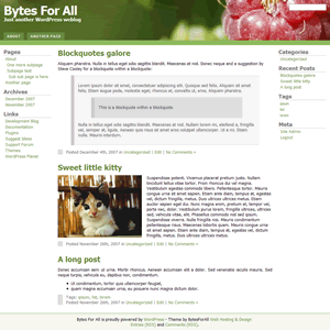
 Bytes For All is my first WordPress theme, a 3 columns fluid width theme with changeable header image. The default header image is a raspberry (shot with Canon EOS 5D & 85/1.2, for the photographically inclined).
You can use that image (commercially, too, in combination with the theme) or add your own image.
By changing a few properties on the theme’s option page you can reveal a bigger part of that (or your) header image.
Download Bytes For All v. 1.20
Test drive Bytes For All
Theme highlights:
Very browser-safe: IE5, IE5.5, IE6, IE7, Firefox, Safari, Opera, and it works nicely on my Nokia 770 as well. It should work well with almost any browser out there.
Valid XHTML 1.0 transitional and valid CSS, and tableless.
Highly customizable: change almost every section of the page, colors, borders, fonts, margins. That’s so much nicer than hacking the CSS, because it’s convenient, and: the layout won’t break.
SEO features included: The Theme itself generates Meta Description tags from the first 25 words of a post, and uses the tags (in WP 2.3.1+) and the category under which the post is filed for the Keywords meta tag. Moves the post title from the second to the first position in the title tag. All this done by the theme itself, no plugin required. This theme generates “source ordered code”. In source ordered code, the middle column with the actual content appears before the left column (and the right column). The column order in the HTML source is 2-1-3 (middle column, left column, right column).
Optimized for WordPress 2.3.1 but works in 2.2.x and 2.1.x as well. Will break in 2.0.x or older. In 2.2.x the subpages widget (see next point) will not be available but everything else is there, and it doesn’t break anywhere. In 2.1.x no widgets at all, but the options page and everything else works fine.
Two level navigation for pages. Top pages are in the horizontal tabs menu, sub pages appear – if there are any for the current page – wherever you put the subpages widget. The top of the left sidebar, near the top menu, is a good place for the subpages. Note: You need to explicitely use the “supages” widget (drag and drop it into one of the two sidebars, at WP Site Admin -> Presentation -> Widgets)
2 sidebars, both widgetized.
License: GPL 2
Changelog:
- v. 1.20 – Dec 18th 2007: Changed the way images are floated/aligned. You don’t need this update if you don’t see any strange behaviour on your site. Under certain conditions, posts or pages will look ugly though, mainly if you use the default “Image float: left” option in the “Bytesforall theme options” page, and do things like using images with short text within list items. This update is mainly a change BACK to a more old-style and intuitive type of dealing with images and text floating around them. Instead of the “modern” but troublesome “float” you’re encouraged to update to version 1.20 and start using the “align” feature of the WordPress editor’s image editor. More info in the README.txt of this update.
- Removed the option for site-wide image float and added clear:left to list elements and p paragraphs. In this new version, use the WordPress editor’s “align” feature in the image editor to align an image left or right within text.
- To break the alignment (if the text wrapping around the image is too short to get past the image by itself, the following text will keep wrapping around the image although you probably wanted to proceed below the image) use a h1, h2, h3 or h4 heading or press “Enter” to start a new paragraph.
- Starting an ordered (1, 2, 3..) or unordered (bullets) list will also stop the text wrapping and the following text will proceed below the image.
- If you made changes to the theme and don’t want to update, set “Image float: left” to “Image float: none” at Site Admin -> Presentation -> Bytesforall Theme Options, and add these lines at around line 123 in header.php, right before </style>:
img {margin: 10px; border: none}.entry ul, .entry ol {clear:both}.entry ul li, .entry ol li {clear: both}.entry p {clear:both}.postmetadata {clear:both}
- v. 1.15 – Dec 11th 2007: 4 minor bugfixes / improvements
- On single post pages, when the title of the next or previous post was too long to fit into the “next – previous post” line above the post, it would break into 2 lines but not push the horizontal divider line at the bottom down as it should, on Firefox, Opera and IE7. FIXED
- On single post pages with a comments box, the W3C validator would complain about the missing “cols” attribute for the textarea, although the textarea width is controlled by CSS and “cols” has no effect whatsoever. FIXED
- When an image was floated in a post and the post’s text was too short to wrap around the whole image, the left gray border of the post’s “postmetadata” line (Posted on … under..) would hide behind the image. FIXED
- The labels on comment forms (Name, Mail, Website) were below their corresponding form field and not on the same line. FIXED


October 27th, 2008 at 5:49 pm
[…] I have installed a new theme that does almost everything I want from a theme. I just had to fiddle with the default link widget to get my dynamic links. This theme is available from Bytes for All. […]